Building Bilingual Products for the US-Mexico Market
Building bilingual products isn't a translation problem - it's a design problem. Here's how I built English/Spanish products that feel native in both languages.

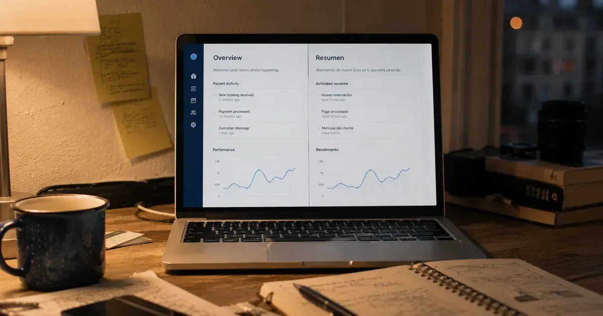
Fifty-three million people in the United States speak Spanish at home. Add Mexico's 130 million, and the US-Mexico linguistic market is nearly 200 million people who navigate between English and Spanish daily.
Building products for this market isn't a translation problem. It's a design problem, a cultural problem, and a business problem wrapped in linguistics. I've built bilingual products on the border, and the lessons go far beyond swapping text strings.
Translation Is the Easy Part
The first instinct when building a bilingual product is to create an English version and translate it. This produces a product that works in both languages but feels native in neither.
The problems with translation-first bilingual products:
Text length varies dramatically. English is often 20-30% shorter than Spanish for the same content. A button that says "Submit" becomes "Enviar solicitud." A heading that fits on one line in English wraps to two lines in Spanish. Every layout needs to accommodate the longer language without looking broken.
Formality levels differ. English has one "you." Spanish has "tu" (informal) and "usted" (formal). A product that uses "tu" feels friendly to young Mexican users and disrespectful to older ones. A product that uses "usted" feels formal to young users and appropriate to older ones. The choice carries cultural weight that doesn't exist in English.
Idioms don't translate. "Sign up" makes sense in English. "Registrate" is the direct translation, but it sounds bureaucratic to many Spanish speakers. "Unete" (join) is warmer. "Crea tu cuenta" (create your account) is more descriptive. The right choice depends on the product's tone and the target audience's expectations.
Regional Spanish varies. Mexican Spanish, Colombian Spanish, Argentine Spanish, and Castilian Spanish differ in vocabulary, slang, and sometimes grammar. A product targeting the US-Mexico market should use Mexican Spanish, not generic Spanish. "Computadora" (Mexico) vs. "ordenador" (Spain) for "computer" is just one of hundreds of differences.
Design for the Longer Language First
A practical rule I follow: design the interface in Spanish first, then adapt for English. Since Spanish text is longer, a layout that works in Spanish will always work in English. The reverse isn't true.
This means:
- Buttons are sized for Spanish text length
- Headings have enough space for wrapped Spanish text
- Form labels accommodate longer descriptions
- Error messages display properly at Spanish text length
- Navigation items don't overflow at Spanish width
Designing for the longer language first prevents the most common bilingual layout bugs: truncated text, overlapping elements, and broken layouts that only appear when someone switches to the non-English version.
Cultural Differences in Digital Behavior
Beyond language, US and Mexican users have different digital behaviors that affect product design:
Trust signals differ. US users trust polished design, social proof, and brand recognition. Mexican users (particularly for new products) trust personal recommendations, WhatsApp sharing, and familiarity with the person behind the product. A landing page optimized for US trust signals may not convert Mexican users, and vice versa.
Payment preferences differ. US users expect credit cards and Apple Pay. Mexican users frequently use cash-based payment methods (OXXO deposits), bank transfers (SPEI), and debit cards. A product that only accepts US payment methods excludes a significant portion of the Mexican market.
Social sharing patterns differ. US users share via Twitter, Facebook, and email. Mexican users share via WhatsApp, overwhelmingly. A share button that only offers Twitter and Facebook misses the primary sharing channel for Mexican users.
Mobile-first is more extreme in Mexico. While mobile is important in the US, it's dominant in Mexico. Many Mexican users access the internet exclusively through their phones. Desktop-first design is a US luxury that doesn't exist in the Mexican market.
Customer support expectations differ. US users expect self-service (FAQ, knowledge bases, chatbots). Mexican users expect human interaction (WhatsApp messages, phone calls, personal responses). A product that only offers automated support will frustrate Mexican users who expect a person on the other end.
The Language Switcher Problem
Every bilingual product needs a way to switch languages. The implementation seems trivial, a dropdown or toggle. The design implications are not.
Where to put it. Top of the page? Footer? Settings? Each location implies different things about how important language choice is. Top-of-page placement says "this is a primary feature." Footer placement says "this is an afterthought."
When to show it. On every page? Only on the first visit? During onboarding? Showing it constantly reminds users they're using a bilingual product (which might feel foreign). Hiding it makes it hard to find when someone wants to switch.
How to detect defaults. Browser language? IP geolocation? User selection during onboarding? Each approach has failure modes. Browser language detection puts a Mexican user's English-language laptop in English even when they prefer Spanish. Geolocation puts a Spanish-speaking San Diego resident in English.
Whether to allow mixing. Some bilingual users prefer the interface in English but content in Spanish (or vice versa). Does the language switcher control everything, or can users mix? In my experience, full-product switching works better than per-section switching, because the cognitive load of a mixed-language interface is higher than a consistent one.
My current approach: detect browser language as default, show a clear language toggle in the header on first visit, and respect the user's choice via a cookie. Simple, visible, user-controlled.
SEO for Bilingual Products
Bilingual SEO is its own discipline:
Separate URLs for each language. /en/about and /es/about, not a single /about that switches based on a cookie. Search engines need separate URLs to index separate language versions.
hreflang tags. Tell search engines which page is the English version and which is the Spanish version. Without hreflang, search engines may show the wrong language version in search results.
Separate keyword research. "Pilot uniform" and "uniforme de piloto" have different search volumes, different competition levels, and different user intent. Bilingual SEO requires keyword research in both languages independently.
Content localization, not translation. Blog posts, landing pages, and product descriptions should be localized (adapted for the cultural context of each language audience) not just translated. A blog post about border crossing tips has different relevant content for English-speaking and Spanish-speaking audiences.
What I Carry Forward
The bilingual product experience on the border gave me skills that apply to every international product:
Internationalization as architecture. Building bilingual from day one is ten times easier than retrofitting it. I now structure every product with i18n capability even if the first version is English-only.
Cultural humility. Assuming that US design patterns work globally is arrogant and wrong. Every market has cultural specifics that affect product design. The border taught me to ask "how do users in this market actually behave?" instead of assuming they behave like US users.
Testing with real users. Bilingual products need testing by native speakers of each language, not just translation review. A native Spanish speaker catches awkward phrasing, cultural mismatches, and confusing flows that a translator might miss.
Building bilingual products is harder than building monolingual products. But the market it unlocks (nearly 200 million people navigating between English and Spanish) is worth the effort.
Enjoyed this article?
I write about building products, AI, aviation, and the journey of entrepreneurship. Follow along for more.
Keep reading

Surfyx: What Building a Surf App Taught Me About Distribution
Surfyx is a surf tracking app and social network. Building it taught me that distribution, not features, determines whether a product succeeds in a niche market.

How I Use AI to Run a One-Person Product Studio
I maintain ~20 products solo. AI is not replacing my work, it is multiplying it. Here is how I use Claude and AI tooling to operate at impossible scale.
Building Software for Lawyers: UX Lessons from a Non-Lawyer
What I learned about designing legal software as someone who has never practiced law, and why outsider perspective might actually be an advantage.