Brojure: Turning Travel Content into Visual Stories
Brojure was a platform for creating visual travel stories. Building it taught me why beautiful products aren't always successful ones.

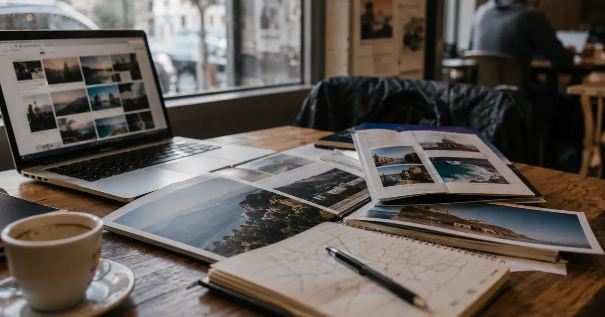
Brojure was born from a simple observation: travel content was either text-heavy blog posts or image-only Instagram feeds. Nothing combined both effectively.
Blog posts about travel destinations had great information but terrible visual presentation, walls of text with occasional photos. Instagram posts had beautiful visuals but no depth, a photo, a caption, a hashtag. Neither format did justice to the experience of discovering a place.
Brojure was a content creation platform for visual travel stories. Think of it as a halfway point between a blog post and an Instagram story: structured content with beautiful presentation, designed specifically for travel and hospitality.
The Product
Brojure let users create "brochures," multi-page visual stories with:
- Full-bleed images as backgrounds with overlaid text
- Multiple layouts: text-left/image-right, full-screen image with caption, side-by-side comparison
- Interactive elements: embedded maps, booking links, price comparisons
- Responsive design that looked good on mobile and desktop
- Shareable URLs that rendered as rich previews on social media
The creation experience was drag-and-drop, no design skills required. Upload your photos, write your text, choose a layout, publish. The platform handled typography, spacing, and responsive behavior automatically.
The target users were travel bloggers, tourism boards, hotels, and travel agencies, anyone who needed to present travel content more beautifully than a blog post allowed.
What I Learned About Content Creation Tools
The creator's curse: tools compete with creating. Content creators don't want to use tools. They want to create content. Every minute spent figuring out the tool is a minute not spent creating. The onboarding has to be near-instant. The first creation has to feel effortless.
Brojure's creation flow was good but not instant. Users needed five to ten minutes to create their first brochure. That sounds fast, but compared to Instagram (take photo, write caption, post) it was slow. In the content creation market, speed to first output is everything.
Templates are the product. Users didn't want a blank canvas. They wanted to choose a template, swap in their content, and publish. The original Brojure launched with a flexible editor and few templates. Engagement improved dramatically when I added curated templates for specific use cases: hotel spotlight, city guide, restaurant review, road trip.
Distribution is harder than creation. Building a tool that creates beautiful content is the easy part. Getting that content in front of an audience is the hard part. Brojure created beautiful pages, but those pages still needed distribution: social sharing, SEO, email newsletters. The content creation tool didn't solve the distribution problem.
This is the fundamental challenge of creator tools: you're building for creators, but creators succeed or fail based on distribution, which you don't control. A content creation tool that also solves distribution (like Medium or Substack) is exponentially more valuable than one that only handles creation.
Visual quality sets expectations. Because Brojure produced beautiful output, users expected beautiful input experiences. Any UI roughness (an alignment issue, an inconsistent animation, a loading spinner in the wrong place) was jarring in a way it wouldn't be in a less design-focused product. When your product's value proposition is beauty, every visual imperfection is a contradiction.
The Business Model Challenge
Brojure's business model was freemium: free creation with limits (number of brochures, storage), paid plans for professional features (custom domains, analytics, team collaboration, white-labeling).
The problem was clear quickly: individual travel bloggers wouldn't pay, and professional users (hotels, tourism boards) wanted enterprise features I hadn't built.
Individual creators have a well-documented willingness-to-pay problem. They'll use free tools extensively but resist paying for premium features. The conversion rate from free to paid for individual creators is typically 2-5%, which requires enormous scale to generate meaningful revenue.
Professional users (hotels, tourism boards, travel agencies) had budget but different needs. They wanted brand customization, team accounts, analytics, and integration with their existing marketing stacks. Building for professionals meant enterprise features, sales processes, and support levels that a solo founder couldn't provide.
Brojure fell into the dangerous middle: too professional for casual creators, too basic for enterprise customers. Finding the right positioning would have required focus, choosing one segment and building deeply for it. I chose instead to move on, applying the lessons to other products.
The Design Principles That Transferred
Despite Brojure's limited commercial success, the design work produced principles I use in every product:
Full-bleed images communicate quality. A product that uses full-width, high-quality images feels more premium than one that constrains images to small boxes. This principle now appears in every landing page and product page I build.
Typography is invisible when it's right. Brojure forced me to learn typography: line height, letter spacing, font pairing, readability at different sizes. Good typography is invisible. Users don't notice it; they just find the content easy to read. Bad typography is immediately noticeable, even to people who can't articulate why.
Progressive disclosure works for creation tools. Show users the minimum controls needed for their current task. Hide advanced options until they're needed. A creation interface with fifty visible controls is intimidating. The same interface with five visible controls and forty-five available on demand is welcoming.
Responsive design isn't optional for content products. Content is consumed on phones. If your content creation tool produces output that looks bad on mobile, the content won't get shared. Mobile-first design for content output isn't a nice-to-have. It's a requirement.
Why Beautiful Isn't Enough
Brojure's biggest lesson was philosophical: a beautiful product isn't automatically a successful product.
I poured design effort into Brojure. The brochures looked stunning. The creation experience was smooth. The output was genuinely better than alternatives. Users who saw Brojure said "this is beautiful."
But "this is beautiful" is different from "I need this." Beauty attracts attention. Need drives adoption. A product can be beautiful and unnecessary, or ugly and indispensable. The ideal is both, but if you have to choose, choose indispensable.
Every product I've built since Brojure starts from need, not beauty. Aviation Infinity isn't the most beautiful study platform, but it's indispensable for pilot students. BorderBot isn't the most beautiful data tool, but it serves a genuine need for border crossing predictions.
Beauty is important. It builds trust, creates delight, and differentiates products in crowded markets. But beauty is a multiplier, not a foundation. If the foundation (utility, need, problem-solving) is weak, no amount of beauty will save the product.
Brojure was beautiful and useful, but not necessary enough for enough people to build a business around. That distinction (useful versus necessary) is the most important product judgment a founder can develop.
Enjoyed this article?
I write about building products, AI, aviation, and the journey of entrepreneurship. Follow along for more.
Keep reading
Surfyx: What Building a Surf App Taught Me About Distribution
Surfyx is a surf tracking app and social network. Building it taught me that distribution, not features, determines whether a product succeeds in a niche market.
How I Use AI to Run a One-Person Product Studio
I maintain ~20 products solo. AI is not replacing my work, it is multiplying it. Here is how I use Claude and AI tooling to operate at impossible scale.
Building Software for Lawyers: UX Lessons from a Non-Lawyer
What I learned about designing legal software as someone who has never practiced law, and why outsider perspective might actually be an advantage.