Getting Started with Allem UI: React & React Native Components
Allem UI is an accessible component library for React and React Native with 44+ components, dark mode, and Tailwind CSS v4. Here is how to install and use it.

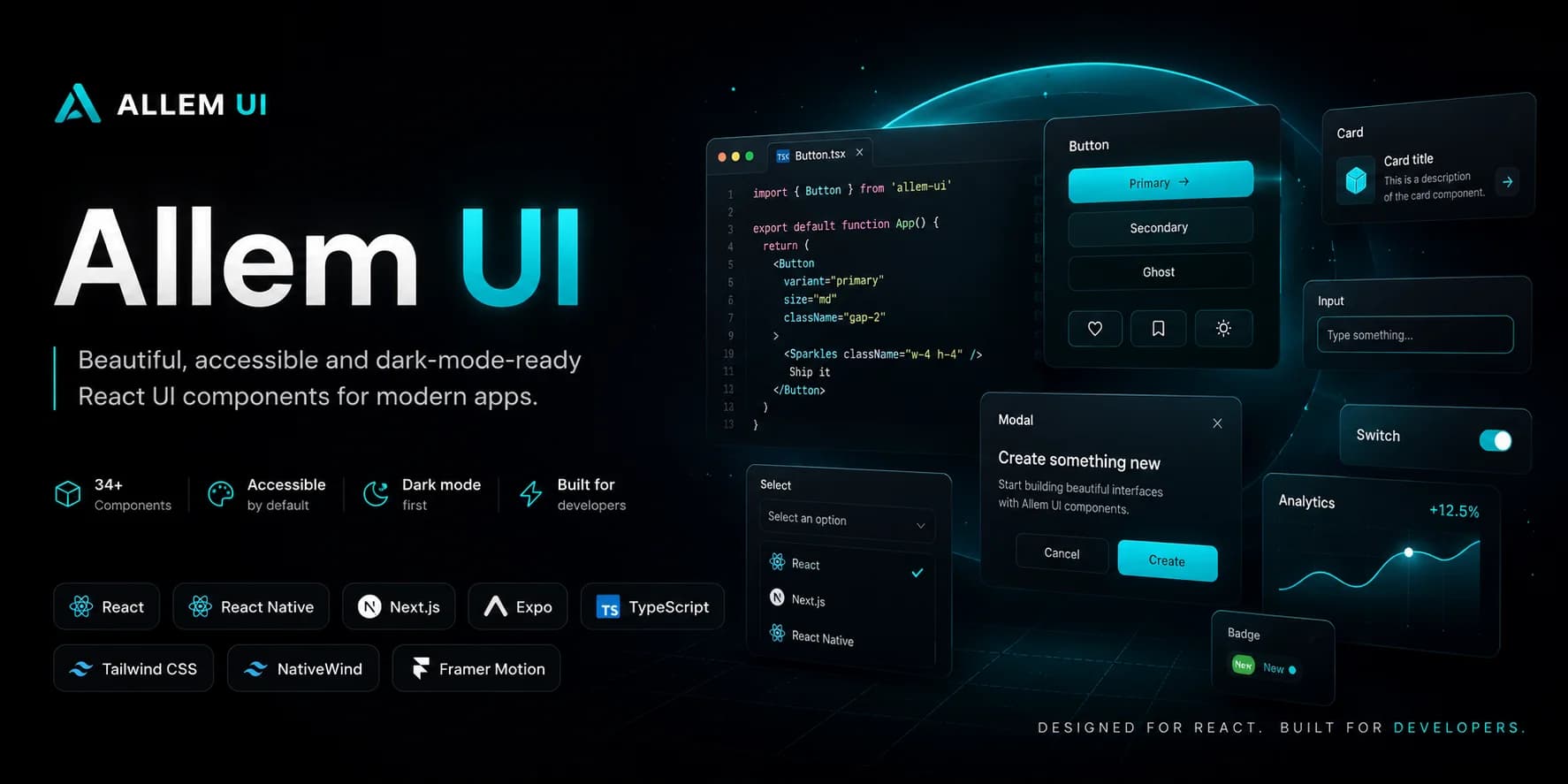
Allem UI is an accessible React and React Native component library built on React Aria and Tailwind CSS v4. It ships 44+ components across 9 packages, supports dark mode out of the box, and works on both web and mobile from a single design system.
This guide covers installing the meta-package, setting up your project, and building your first interface with Allem UI.
Why Allem UI?
Most component libraries force you to choose between web and mobile, or between accessibility and customization. Allem UI gives you both:
- Accessible by default — built on React Aria with full keyboard navigation, ARIA attributes, and screen reader support
- Web + Native —
@allem-ui/reactfor the web,@allem-ui/nativefor React Native, same prop API - Tailwind CSS v4 — design tokens, dark mode, and class merging with the
cn()utility - Modular — install everything with
allem-uior pick individual packages
Installation
The fastest way to get started is with the meta-package, which installs all 9 packages at once:
npm install allem-ui
You also need Tailwind CSS v4 as a peer dependency:
npm install tailwindcss@4
What You Get
The allem-ui meta-package includes:
| Package | Description |
|---|---|
@allem-ui/react |
30+ web components (Button, Input, Modal, Table, etc.) |
@allem-ui/native |
44 React Native components (34 ported + 10 mobile-only) |
@allem-ui/theme |
Tailwind CSS v4 preset with design tokens |
@allem-ui/date-picker |
Calendar, DatePicker, DateRangePicker, TimeField |
@allem-ui/data-grid |
TanStack-powered data grid with sorting, filtering, pagination |
@allem-ui/chat |
Chat UI components with typing indicators |
@allem-ui/kanban |
Kanban board with drag-and-drop |
@allem-ui/pricing |
Pricing tables and comparison components |
@allem-ui/changelog |
Changelog timeline and version badges |
Or Pick What You Need
If you only need a few packages, install them individually:
# Core web components + theme
npm install @allem-ui/react @allem-ui/theme

# Add date picking
npm install @allem-ui/date-picker

# Add data grid (requires TanStack Table)
npm install @allem-ui/data-grid @tanstack/react-table
Setup
1. Configure Tailwind
Add the Allem UI preset to your Tailwind config and include the component class paths in your content array:
// tailwind.config.ts
import { allemPreset } from "@allem-ui/theme";

export default {
  presets: [allemPreset],
  darkMode: "class",
  content: [
    "./src/**/*.{ts,tsx}",
    "./node_modules/@allem-ui/react/dist/**/*.{js,mjs}",
    "./node_modules/@allem-ui/date-picker/dist/**/*.{js,mjs}",
    "./node_modules/@allem-ui/data-grid/dist/**/*.{js,mjs}",
    "./node_modules/@allem-ui/chat/dist/**/*.{js,mjs}",
    "./node_modules/@allem-ui/kanban/dist/**/*.{js,mjs}",
    "./node_modules/@allem-ui/pricing/dist/**/*.{js,mjs}",
    "./node_modules/@allem-ui/changelog/dist/**/*.{js,mjs}",
  ],
};
Include the dist/**/*.{js,mjs} path for every Allem UI package you install so Tailwind scans the component class names.
2. Import and Use
All components include the "use client" directive, so they work directly in Next.js App Router server components without extra wrappers.
import { Button, Input, Card, CardBody } from "@allem-ui/react";

export default function Page() {
  return (
    <Card>
      <CardBody>
        <Input label="Email" type="email" placeholder="you@example.com" />
        <Button onPress={() => console.log("clicked")}>Submit</Button>
      </CardBody>
    </Card>
  );
}
Core Concepts
Consistent Prop API
Every interactive component follows the same naming conventions:
variant— Visual style:"solid","outline","ghost","link"size—"sm" | "md" | "lg"(default:"md")color—"primary" | "neutral" | "danger" | "success" | "warning"(default:"primary")className— Tailwind classes merged viacn()for overrides
<Button variant="outline" color="danger" size="lg" onPress={handleDelete}>
  Delete Account
</Button>
Dark Mode
All components support dark mode automatically via Tailwind's dark: variant. Set darkMode: "class" in your Tailwind config, toggle the dark class on your HTML element, and every component adapts.
Use onPress, Not onClick
Allem UI is built on React Aria. Interactive components use onPress instead of onClick, which gives you cross-device support for mouse, touch, and keyboard events out of the box.
// Correct
<Button onPress={() => save()}>Save</Button>

// Avoid
<Button onClick={() => save()}>Save</Button>
Class Merging with cn()
Override any component's styles with the className prop. Allem UI exports a cn() utility that safely merges Tailwind classes:
import { Button, cn } from "@allem-ui/react";

<Button className={cn("rounded-full px-8", isActive && "ring-2")}>
  Pill Button
</Button>
Building a Complete Form
Here is a real-world example combining multiple components:
import {
  Input,
  Textarea,
  Select,
  SelectItem,
  Checkbox,
  Button,
  Card,
  CardHeader,
  CardBody,
  CardFooter,
} from "@allem-ui/react";

function ContactForm() {
  return (
    <Card>
      <CardHeader>
        <h2 className="text-lg font-semibold">Contact Us</h2>
      </CardHeader>
      <CardBody className="space-y-4">
        <Input label="Name" isRequired />
        <Input label="Email" type="email" isRequired />
        <Select label="Subject">
          <SelectItem id="general">General Inquiry</SelectItem>
          <SelectItem id="support">Support</SelectItem>
          <SelectItem id="sales">Sales</SelectItem>
        </Select>
        <Textarea label="Message" rows={4} />
        <Checkbox>I agree to the privacy policy</Checkbox>
      </CardBody>
      <CardFooter>
        <Button variant="ghost" color="neutral">Cancel</Button>
        <Button type="submit">Send Message</Button>
      </CardFooter>
    </Card>
  );
}
Adding Toast Notifications
Wrap your app with ToastProvider, then call useToast() anywhere:
import { ToastProvider, useToast, Button } from "@allem-ui/react";

// In your layout
<ToastProvider position="bottom-right">
  <App />
</ToastProvider>

// In any component
function SaveButton() {
  const { toast } = useToast();

  const handleSave = async () => {
    await saveData();
    toast({ title: "Saved!", variant: "success", duration: 3000 });
  };

  return <Button onPress={handleSave}>Save</Button>;
}
Adding a Modal
Modals use a trigger-based pattern. The first child is the trigger element, the second is the modal content:
import { Modal, ModalContent, Button } from "@allem-ui/react";

<Modal>
  <Button>Open Modal</Button>
  <ModalContent title="Confirm Action" size="md">
    <p>Are you sure you want to proceed?</p>
    <div className="flex gap-2 justify-end mt-4">
      <Button variant="outline">Cancel</Button>
      <Button color="danger">Confirm</Button>
    </div>
  </ModalContent>
</Modal>
Click-outside and Escape dismiss the modal by default.
React Native Setup
If you are building a mobile app, Allem UI's native package provides 44 components with the same prop API:
npm install @allem-ui/native react-native nativewind
Wrap your app with the providers:
import { ThemeProvider, ToastProvider } from "@allem-ui/native";

export default function App() {
  return (
    <ThemeProvider>
      <ToastProvider>
        {/* Your app */}
      </ToastProvider>
    </ThemeProvider>
  );
}
Use components with the same API as the web:
import { Button, Input, Avatar } from "@allem-ui/native";

<Input label="Email" placeholder="you@example.com" />
<Button variant="solid" color="primary">Submit</Button>
<Avatar src="https://example.com/photo.jpg" name="Ahmed" status="online" />
The native package also includes 10 mobile-only components like BottomSheet, ActionSheet, SwipeableRow, FAB, OTPInput, and more.
What's Next
Each package has its own detailed guide:
- @allem-ui/react — All 30+ web components
- @allem-ui/native — React Native components
- @allem-ui/theme — Design tokens and customization
- @allem-ui/date-picker — Calendar and date selection
- @allem-ui/data-grid — Sortable, filterable data tables
- @allem-ui/chat — Chat UI components
- @allem-ui/kanban — Drag-and-drop kanban boards
- @allem-ui/pricing — Pricing tables
- @allem-ui/changelog — Changelog timelines
Star the repo on GitHub, browse all packages on npm, and install it with npm install allem-ui to get started.
Enjoyed this article?
I write about building products, AI, aviation, and the journey of entrepreneurship. Follow along for more.
Keep reading

Getting Started with Allem UI Date Picker: Accessible Calendars for React
Learn how to set up @allem-ui/date-picker with Calendar, DatePicker, DateRangePicker, and TimeField components built on React Aria.

Getting Started with Allem UI Data Grid: Sortable, Filterable Tables for React
Learn how to set up @allem-ui/data-grid with TanStack Table to build sortable, filterable, and paginated data tables in React.

Getting Started with Allem UI React: Build Accessible Interfaces in Minutes
Learn how to install @allem-ui/react, set up Tailwind CSS v4, and build your first accessible interface with 30+ production-ready components.