Getting Started with Allem UI Native: React Native Components from the Same Design System
Learn how to set up @allem-ui/native with 44 React Native components that share the same prop API as Allem UI for web, plus 10 mobile-only components.

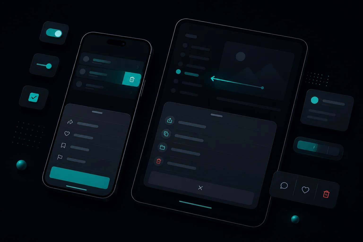
@allem-ui/native brings Allem UI's design system to React Native. It ships 44 components — 34 ported from the web library with the same prop API, plus 10 mobile-only components like BottomSheet, ActionSheet, and SwipeableRow. Styled with NativeWind, it supports dark mode and works with Expo and bare React Native projects.
Installation
npm install @allem-ui/native react-native nativewind
If you are using Expo:
npx expo install @allem-ui/native nativewind
Setup
Wrap your app in ThemeProvider and ToastProvider:
import { ThemeProvider, ToastProvider } from "@allem-ui/native";

export default function App() {
  return (
    <ThemeProvider>
      <ToastProvider>
        {/* Your app screens */}
      </ToastProvider>
    </ThemeProvider>
  );
}
Basic Usage
Components use the same prop API as @allem-ui/react, so code translates directly between web and mobile:
import { Button, Input, Avatar } from "@allem-ui/native";

export default function ProfileScreen() {
  return (
    <>
      <Avatar
        src="https://example.com/photo.jpg"
        name="Ahmed"
        status="online"
      />
      <Input label="Email" placeholder="you@example.com" />
      <Button variant="solid" color="primary" onPress={() => console.log("save")}>
        Save Profile
      </Button>
    </>
  );
}
Shared Prop API
The same variant, size, and color props work across web and native:
// These props work identically on @allem-ui/react and @allem-ui/native
<Button variant="solid" size="md" color="primary">Submit</Button>
<Button variant="outline" color="danger">Delete</Button>
<Button variant="ghost" size="sm">Cancel</Button>
This consistency means you can share component logic between a Next.js web app and a React Native mobile app without relearning the API.
Mobile-Only Components
@allem-ui/native includes 10 components designed specifically for mobile interactions:
BottomSheet
A draggable bottom sheet with snap points:
import { BottomSheet } from "@allem-ui/native";

<BottomSheet snapPoints={["25%", "50%", "90%"]}>
  <Text>Drag me up or down</Text>
</BottomSheet>
ActionSheet
A native-feeling action menu that slides up from the bottom:
import { ActionSheet } from "@allem-ui/native";

<ActionSheet
  actions={[
    { label: "Share", onPress: handleShare },
    { label: "Edit", onPress: handleEdit },
    { label: "Delete", onPress: handleDelete, destructive: true },
  ]}
  cancelLabel="Cancel"
/>
SwipeableRow
Swipe-to-reveal actions on list items:
import { SwipeableRow } from "@allem-ui/native";

<SwipeableRow
  rightActions={[
    { label: "Delete", color: "danger", onPress: handleDelete },
    { label: "Archive", color: "neutral", onPress: handleArchive },
  ]}
>
  <ListItem title="Inbox message" />
</SwipeableRow>
FAB (Floating Action Button)
A floating button positioned at the bottom-right:
import { FAB } from "@allem-ui/native";

<FAB
  icon="plus"
  onPress={() => navigation.navigate("NewItem")}
  color="primary"
/>
OTPInput
A segmented input for verification codes:
import { OTPInput } from "@allem-ui/native";

<OTPInput
  length={6}
  onComplete={(code) => verifyCode(code)}
/>
Dark Mode
The ThemeProvider handles dark mode. Pass the color scheme from the system or your app's settings:
import { useColorScheme } from "react-native";
import { ThemeProvider } from "@allem-ui/native";

export default function App() {
  const colorScheme = useColorScheme();

  return (
    <ThemeProvider mode={colorScheme ?? "light"}>
      {/* All components adapt to dark/light */}
    </ThemeProvider>
  );
}
Complete Screen Example
A sign-in screen using native components:
import {
  Button, Input, Card, CardBody, CardHeader, Text, Divider,
} from "@allem-ui/native";
import { View } from "react-native";

export default function SignInScreen() {
  return (
    <View style={{ flex: 1, justifyContent: "center", padding: 24 }}>
      <Card>
        <CardHeader>
          <Text size="lg" weight="bold">Sign In</Text>
        </CardHeader>
        <CardBody>
          <Input
            label="Email"
            placeholder="you@example.com"
            keyboardType="email-address"
            autoCapitalize="none"
          />
          <Input
            label="Password"
            placeholder="Enter your password"
            secureTextEntry
          />
          <Button onPress={() => console.log("sign in")} className="mt-4">
            Sign In
          </Button>
          <Divider className="my-4" />
          <Button variant="outline" onPress={() => console.log("sign up")}>
            Create Account
          </Button>
        </CardBody>
      </Card>
    </View>
  );
}
Web and Native Side by Side
One of the key benefits of Allem UI is code portability. Here is the same form rendered on both platforms:
Web (@allem-ui/react):
import { Button, Input } from "@allem-ui/react";

<Input label="Email" placeholder="you@example.com" />
<Button onPress={handleSubmit}>Submit</Button>
Native (@allem-ui/native):
import { Button, Input } from "@allem-ui/native";

<Input label="Email" placeholder="you@example.com" />
<Button onPress={handleSubmit}>Submit</Button>
The imports change. The code stays the same.
What's Next
- Explore the Allem UI web components
- Read the theme setup guide
- Check the Allem UI getting started guide for the full library overview
Enjoyed this article?
I write about building products, AI, aviation, and the journey of entrepreneurship. Follow along for more.
Keep reading
Getting Started with Allem UI Date Picker: Accessible Calendars for React
Learn how to set up @allem-ui/date-picker with Calendar, DatePicker, DateRangePicker, and TimeField components built on React Aria.

Getting Started with Allem UI Data Grid: Sortable, Filterable Tables for React
Learn how to set up @allem-ui/data-grid with TanStack Table to build sortable, filterable, and paginated data tables in React.

Getting Started with Allem UI React: Build Accessible Interfaces in Minutes
Learn how to install @allem-ui/react, set up Tailwind CSS v4, and build your first accessible interface with 30+ production-ready components.