Building a Design System as a Team of One (No Figma Needed)
I'm a developer, not a designer - but I maintain consistent UI across 6 products. Here's how building a design system as a solo founder works with Tailwind.


I'm a developer, not a designer. I've never opened Figma for anything more complex than cropping an image. Yet I maintain a consistent visual identity across multiple production products. How? By building a design system that's optimized for a team of one: practical, minimal, and embedded in code rather than design files.
Why a Solo Founder Needs a Design System
The conventional argument for design systems is consistency across a team: when fifty designers and developers are building features, a shared system ensures everything looks cohesive. As a solo founder, I don't have that problem. I'm the only person building anything.
But I do have a different problem: cognitive load across products. When I switch from working on Aviation Infinity to fixing a bug on Babonbo, I need the UI patterns to be familiar. If every product uses different button styles, different spacing scales, different color approaches, I waste mental energy on design decisions that should be automatic.
My design system isn't about team consistency. It's about personal efficiency. It lets me make design decisions once and apply them everywhere, freeing my brain for the decisions that actually matter: product logic, user experience, and content.
What's Actually in My Design System
My design system is deliberately minimal. It covers the decisions that I'd otherwise make repeatedly and inconsistently.
The color system is a set of semantic color tokens: primary, secondary, success, warning, error, and neutral. Each token has a scale from light to dark. The actual hue varies by product (Aviation Infinity uses blue, Babonbo uses teal, ClickAi uses purple), but the semantic structure is identical. This means a "primary button" component works across all products; only the underlying color changes.
The typography scale defines six text sizes with corresponding line heights and letter spacing. I use the same scale across all products, which means text hierarchy is always consistent. Headings, body text, captions, and labels always relate to each other in the same proportions.
The spacing scale is based on a 4px grid: 4, 8, 12, 16, 24, 32, 48, 64, 96. Every margin, padding, and gap in every product uses values from this scale. This sounds restrictive, but in practice it's liberating. I never spend time deciding whether a section should have 37px or 42px of padding. It's either 32 or 48. The constraint makes the decision instant.
The component library is small: buttons, inputs, cards, modals, navigation bars, and a few layout primitives. Each component has defined variants (primary/secondary/ghost for buttons, for example) and defined sizes. There are no one-off components.
Tailwind CSS as the Foundation
Tailwind CSS is the reason my design system works as a solo operation. Without Tailwind, I'd need to maintain a CSS framework, a component library, and documentation to keep everything consistent. With Tailwind, the design system is expressed directly in the utility classes I use.
My Tailwind configuration file is my design system. The color tokens, spacing scale, typography scale, and responsive breakpoints are all defined there. When I use bg-primary-500 or text-lg or p-6, I'm not writing ad hoc styles. I'm applying my design system.
The configuration is shared across products through a package that each product imports. When I adjust the spacing scale or update a color, every product picks up the change automatically. This is simpler and more reliable than any design-system-in-Figma approach I've seen.
The utility-first approach also means I can see the design decisions in the markup. When I look at a component, the Tailwind classes tell me exactly what design tokens it's using. There's no indirection through CSS class names, no hunting through stylesheets to understand why something looks the way it does.
The Component Strategy
My components are built in React with TypeScript, using Tailwind for styling. They're not published as an npm package. They live in a shared directory that each product references.
The components are intentionally simple. A button component accepts a variant (primary, secondary, ghost), a size (sm, md, lg), and standard HTML button props. It renders a button element with the appropriate Tailwind classes. There's no complex state management, no animation library, no theming engine.
This simplicity is a feature, not a limitation. Complex component libraries require maintenance, documentation, and migration efforts when they change. My simple components require almost no maintenance because there's almost nothing to maintain.
When a product needs something the shared components don't cover, I build it as a product-specific component. If I find myself building the same product-specific component for a second product, I promote it to the shared library. This organic growth keeps the shared library lean and battle-tested.
Dark Mode Without the Pain
All my products support dark mode via next-themes. The design system makes this manageable by defining dark mode colors alongside light mode colors in the Tailwind configuration.
Each semantic color token has a light and dark variant. primary-500 is the main brand color in light mode. In dark mode, it adjusts to maintain readability and visual hierarchy. The Tailwind dark variant (dark:bg-primary-400) handles the switch.
Because the color system is semantic rather than literal, I only need to define the dark mode palette once. Every component that uses bg-primary-500 dark:bg-primary-400 automatically looks right in both modes. I don't need to manually dark-mode-ify every component.
The discipline of using semantic colors consistently is what makes dark mode manageable. If I'd used literal colors (bg-blue-500) throughout my products, dark mode would require touching every component. With semantic colors, it requires touching only the theme configuration.
What I Deliberately Left Out
A real design system at a large company includes things I've intentionally omitted.
Design tokens in a platform-agnostic format (like Style Dictionary). My products are all React/Next.js, so Tailwind configuration is sufficient. If I were building native mobile apps, I'd need a more portable token format.
Comprehensive documentation. My design system doesn't have a Storybook instance or a documentation site. The components are simple enough that the TypeScript interfaces serve as documentation. If I ever bring on another developer, this would be the first investment.
Animation and motion guidelines. I use Framer Motion for animations, but the specific animations are product-specific rather than standardized. A modal entrance animation on Aviation Infinity can be different from one on Babonbo. Motion is too context-dependent to standardize at my scale.
Accessibility guidelines beyond what's built into the components. Each component handles basic accessibility (keyboard navigation, ARIA attributes, focus management), but I don't have a comprehensive accessibility testing suite. This is a gap I'm aware of and plan to address.
The Maintenance Burden
The honest truth about maintaining a design system as a solo founder is that maintenance is minimal but not zero.
The Tailwind configuration needs occasional updates. When I decide that a color isn't working or that I need an additional spacing value, I update the config and check that nothing breaks across products. This happens maybe once a quarter.
Components need updates when I discover edge cases. A button component that doesn't handle long text gracefully, a card component that breaks at certain viewport widths. These fixes are typically small and quick, but they need to be applied to the shared library and tested across products.
The biggest maintenance task is resisting feature creep. Every few weeks, I'm tempted to add a new component variant, a new color token, or a new utility. Most of the time, I resist. The system's value comes from its constraints, and every addition makes it slightly harder to keep everything in my head.
Advice for Other Solo Builders
If you're a solo developer building multiple products and thinking about design consistency, here's what I'd suggest.
Start with Tailwind CSS and a well-thought-out configuration file. This alone gives you 80% of what a design system provides with 10% of the effort.
Define your color palette, spacing scale, and typography scale before building components. These foundational decisions affect everything, and changing them later is expensive.
Build components only when you need them for the second time. The first time you need a modal, build it inline. The second time, extract it to a shared component. This ensures your component library contains only components that are genuinely reused.
Keep the system in code, not in design files. As a developer, your source of truth should be code. Design files are an extra artifact to maintain, and for a solo operation, that overhead isn't justified.
Accept imperfection. A design system maintained by one person will never be as comprehensive or polished as one maintained by a dedicated team. That's fine. It doesn't need to be perfect. It needs to make your daily development faster and your products more consistent. If it does those two things, it's working.
My design system isn't impressive by industry standards. But it lets me build and maintain multiple products that all look professional and feel cohesive, without ever hiring a designer. For a solo technical founder, that's exactly what success looks like.
Enjoyed this article?
I write about building products, AI, aviation, and the journey of entrepreneurship. Follow along for more.
Keep reading

Getting Started with Allem SDK: React Hooks for AI, Forms & Auth
Allem SDK is a collection of React hooks for AI chat, form validation, authentication, analytics, and utilities. Here is how to install and use it.

Getting Started with Allem UI: React & React Native Components
Allem UI is an accessible component library for React and React Native with 44+ components, dark mode, and Tailwind CSS v4. Here is how to install and use it.
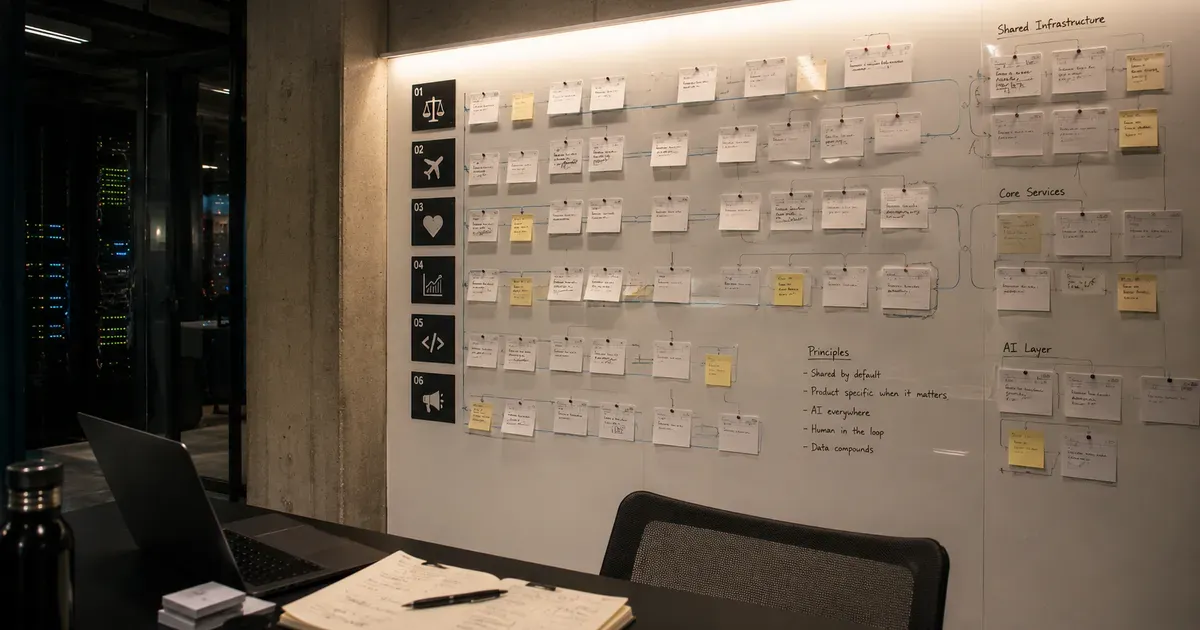
The Agento Suite: Building 6 AI Products in Parallel
In 2026, I launched six AI products across legal tech, travel, healthcare, and developer tools. Here is the architecture and playbook for building in parallel.