Getting Started with Allem UI Theme: Tailwind CSS v4 Design Tokens for React
Learn how to set up @allem-ui/theme with Tailwind CSS v4, configure design tokens, enable dark mode, and customize the color system.

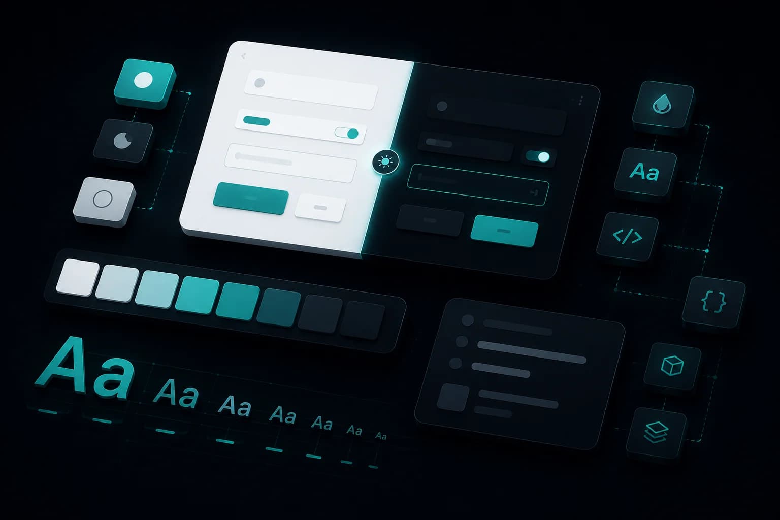
@allem-ui/theme is the design foundation of Allem UI. It provides a Tailwind CSS v4 preset with design tokens, color scales, dark mode support, and custom animations. Every Allem UI component uses these tokens, and you can extend or override them for your project.
Installation
npm install @allem-ui/theme tailwindcss@4
Setup
1. Tailwind Config
Add the Allem UI preset to your Tailwind configuration:
// tailwind.config.ts
import { allemPreset } from "@allem-ui/theme";

export default {
  presets: [allemPreset],
  darkMode: "class",
  content: [
    "./src/**/*.{ts,tsx}",
    "./node_modules/@allem-ui/react/dist/**/*.{js,mjs}",
  ],
};
The preset registers Allem UI's design tokens (colors, spacing, typography) into Tailwind's theme system.
2. CSS Setup
In your globals.css, import Tailwind and register the Allem UI sources:
@import "tailwindcss";
@source "@allem-ui/react";
@source "@allem-ui/theme";
3. React Aria Variants
Allem UI components use React Aria data attributes for interactive states. Register these custom variants:
@custom-variant selected (&[data-selected]);
@custom-variant pressed (&[data-pressed]);
@custom-variant dragging (&[data-dragging]);
@custom-variant focus-visible (&[data-focus-visible]);
@custom-variant disabled (&[data-disabled]);
@custom-variant placeholder-shown (&[data-placeholder]);
4. Dark Mode
Enable the class-based dark mode variant:
@custom-variant dark (&:where(.dark, .dark *));
5. Animations
Register the built-in animations that components like Spinner and Toast use:
@theme {
  --animate-allem-spin: spin 0.6s linear infinite;
  --animate-allem-pulse: pulse 1.5s cubic-bezier(0.4, 0, 0.6, 1) infinite;
  --animate-allem-fade-in: allemFadeIn 0.2s ease-out;
  --animate-allem-slide-up: allemSlideUp 0.2s ease-out;
}

@keyframes allemFadeIn {
  0% { opacity: 0; }
  100% { opacity: 1; }
}

@keyframes allemSlideUp {
  0% { opacity: 0; transform: translateY(4px); }
  100% { opacity: 1; transform: translateY(0); }
}
Color System
The theme provides five semantic color scales:
| Color | Usage |
|---|---|
primary |
Main actions, links, active states |
neutral |
Text, borders, backgrounds |
danger |
Destructive actions, errors |
success |
Confirmations, positive states |
warning |
Caution, attention required |
Use them with any Tailwind utility:
<div className="bg-primary-500 text-white">Primary background</div>
<div className="border border-danger-500 text-danger-700">Error state</div>
<span className="text-success-600">Operation successful</span>
Every component accepts a color prop that maps to these scales:
<Button color="primary">Submit</Button>
<Button color="danger">Delete</Button>
<Badge color="success">Active</Badge>
Dark Mode
All Allem UI components adapt to dark mode automatically. Toggle it by adding the dark class to your <html> element:
<html className="dark">
  <body>
    {/* All components render in dark mode */}
  </body>
</html>
With next-themes
For automatic system preference detection:
import { ThemeProvider } from "next-themes";

export default function Layout({ children }: { children: React.ReactNode }) {
  return (
    <html suppressHydrationWarning>
      <body>
        <ThemeProvider attribute="class">{children}</ThemeProvider>
      </body>
    </html>
  );
}
Theme Toggle
"use client";
import { useTheme } from "next-themes";
import { Button } from "@allem-ui/react";

export function ThemeToggle() {
  const { theme, setTheme } = useTheme();

  return (
    <Button
      variant="ghost"
      size="sm"
      onPress={() => setTheme(theme === "dark" ? "light" : "dark")}
    >
      {theme === "dark" ? "Light Mode" : "Dark Mode"}
    </Button>
  );
}
Adding More Packages
When you install additional Allem UI packages, add their source paths so Tailwind scans their component classes:
/* globals.css */
@source "@allem-ui/date-picker";
@source "@allem-ui/data-grid";
@source "@allem-ui/chat";
@source "@allem-ui/kanban";
@source "@allem-ui/pricing";
@source "@allem-ui/changelog";
@source "@allem-ui/rich-text";
@source "@allem-ui/file-upload";
@source "@allem-ui/command";
Complete Setup File
Here is a full globals.css with all packages registered:
@import "tailwindcss";

/* Allem UI sources */
@source "@allem-ui/react";
@source "@allem-ui/theme";
@source "@allem-ui/date-picker";
@source "@allem-ui/data-grid";
@source "@allem-ui/chat";
@source "@allem-ui/kanban";
@source "@allem-ui/pricing";
@source "@allem-ui/changelog";
@source "@allem-ui/rich-text";
@source "@allem-ui/file-upload";
@source "@allem-ui/command";

/* React Aria variants */
@custom-variant selected (&[data-selected]);
@custom-variant pressed (&[data-pressed]);
@custom-variant dragging (&[data-dragging]);
@custom-variant focus-visible (&[data-focus-visible]);
@custom-variant disabled (&[data-disabled]);
@custom-variant placeholder-shown (&[data-placeholder]);

/* Dark mode */
@custom-variant dark (&:where(.dark, .dark *));

/* Animations */
@theme {
  --animate-allem-spin: spin 0.6s linear infinite;
  --animate-allem-pulse: pulse 1.5s cubic-bezier(0.4, 0, 0.6, 1) infinite;
  --animate-allem-fade-in: allemFadeIn 0.2s ease-out;
  --animate-allem-slide-up: allemSlideUp 0.2s ease-out;
}

@keyframes allemFadeIn {
  0% { opacity: 0; }
  100% { opacity: 1; }
}

@keyframes allemSlideUp {
  0% { opacity: 0; transform: translateY(4px); }
  100% { opacity: 1; transform: translateY(0); }
}
What's Next
- Explore the Allem UI React components that use this theme
- Read the full installation guide
- Check the Allem UI getting started guide for the complete library overview
Enjoyed this article?
I write about building products, AI, aviation, and the journey of entrepreneurship. Follow along for more.
Keep reading
Getting Started with Allem UI Date Picker: Accessible Calendars for React
Learn how to set up @allem-ui/date-picker with Calendar, DatePicker, DateRangePicker, and TimeField components built on React Aria.

Getting Started with Allem UI Data Grid: Sortable, Filterable Tables for React
Learn how to set up @allem-ui/data-grid with TanStack Table to build sortable, filterable, and paginated data tables in React.

Getting Started with Allem UI React: Build Accessible Interfaces in Minutes
Learn how to install @allem-ui/react, set up Tailwind CSS v4, and build your first accessible interface with 30+ production-ready components.